Verdant
Branding, Motion, Social, Web
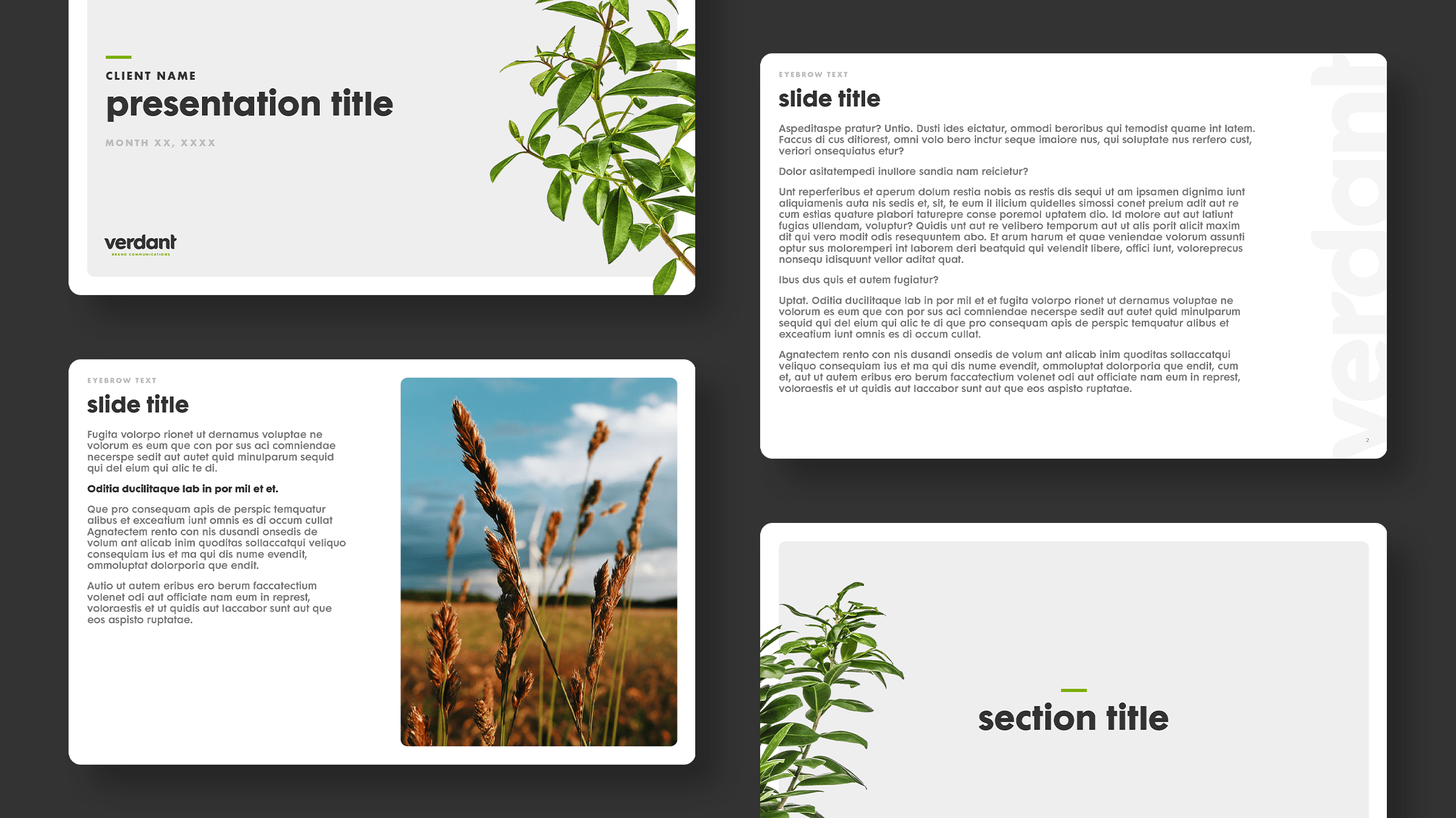
A creative marketing agency was looking to reestablish itself with a new look and new attitude. The attitude came easily from new management, but the look needed some nurturing. I led the push for the brand’s eventual visual language and accompanying communication assets.

Rooted in creativity
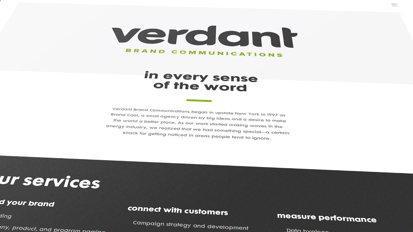
The name “Verdant” was chosen as it’s defined as “green with grass or other rich vegetation”. Used to describe exceptionally fertile ground, the Verdant logo represents the creatively transformational.
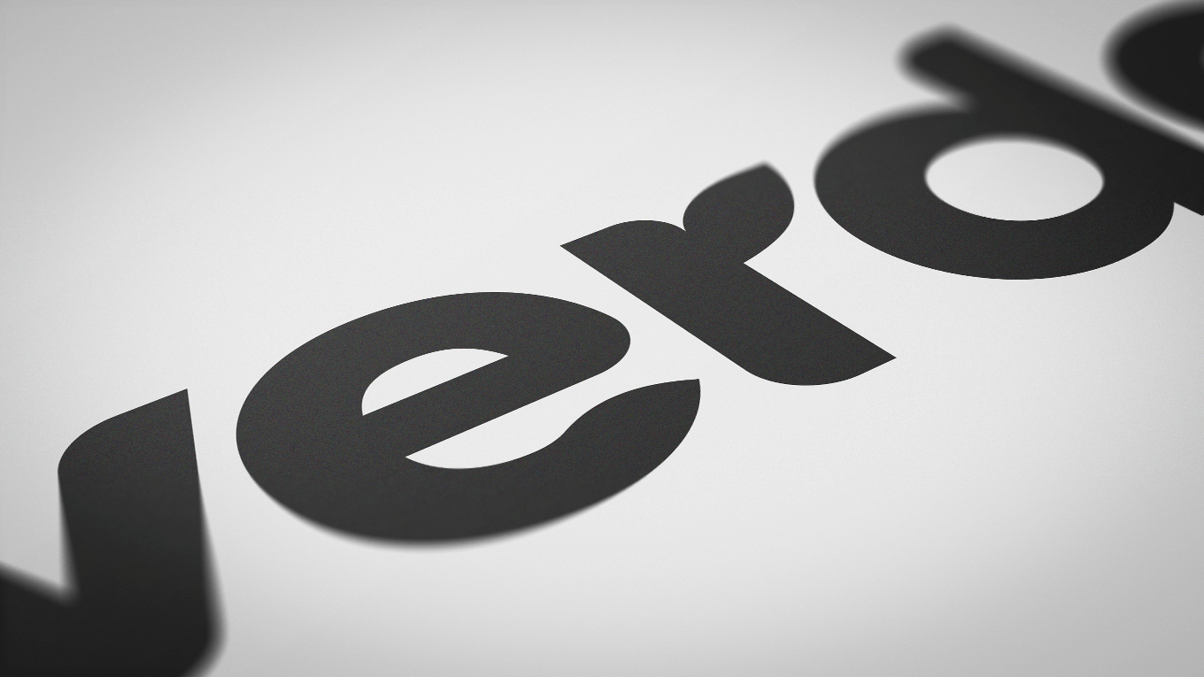
With such a botanical name, the logomark needed to match. We rounded certain corners of the letterforms to subtly mimic leaf shapes “sprouting” to convey the bountiful nature of our work in a clean, modern, and simple way. The design is geometric yet a little organic, just like nature itself.

Turning the page
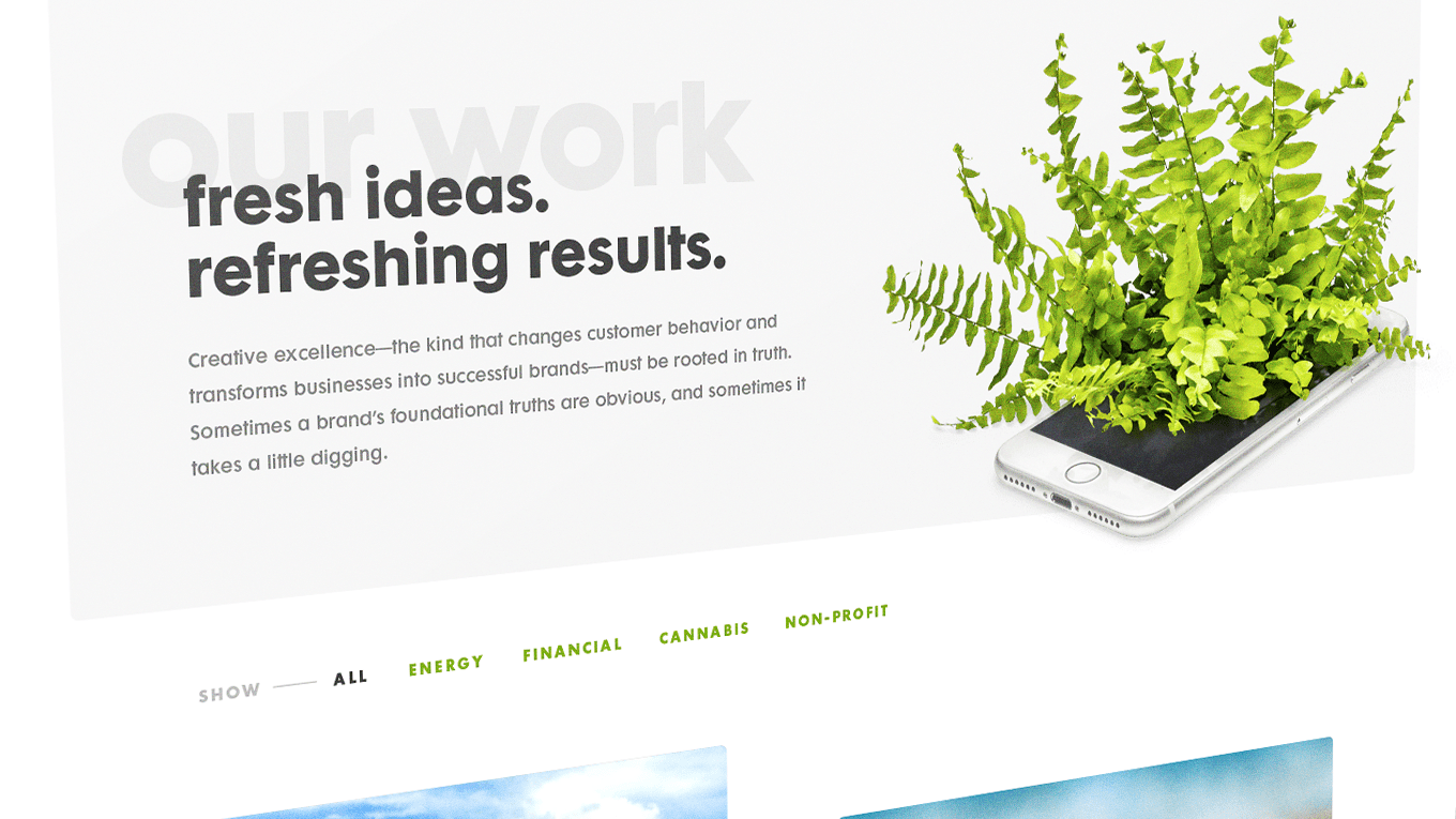
Scattered with plants, the new website leverages fun animations with clean and bold typography. We wanted the first visual users see to be eye-catching and pair perfectly with our tagline “We grow things. Brands, mostly.”
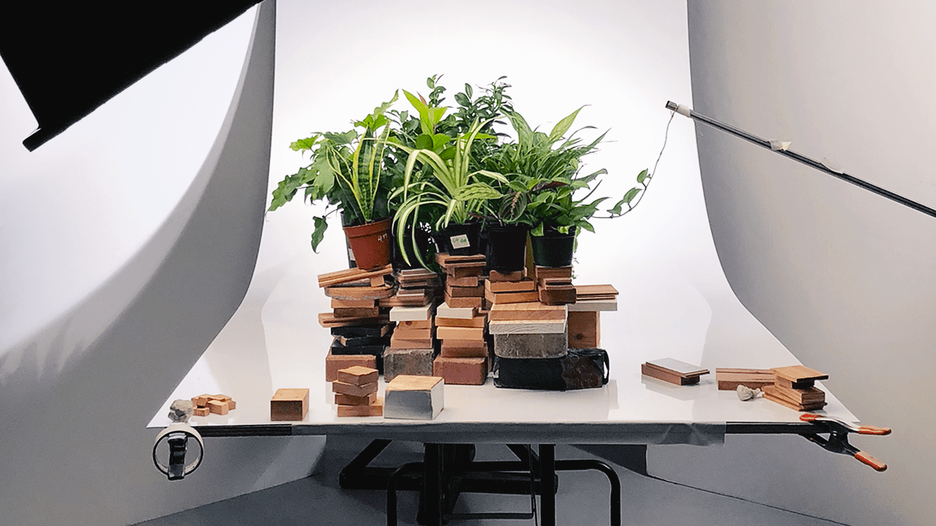
Flora blossoming out of a computer screen was what we wanted — and the perfect depiction of creativity. I art directed a photoshoot with a local photographer to capture the stills that made up the plant-computer stop motion animation, as well as additional shots of a variety of leaves and plants for brand use.

Award-Winning WorkThe Verdant website won Silver at the District 2 Regional American Advertising Awards and Gold at the local Rochester American Advertising Awards.
Cultivating a following
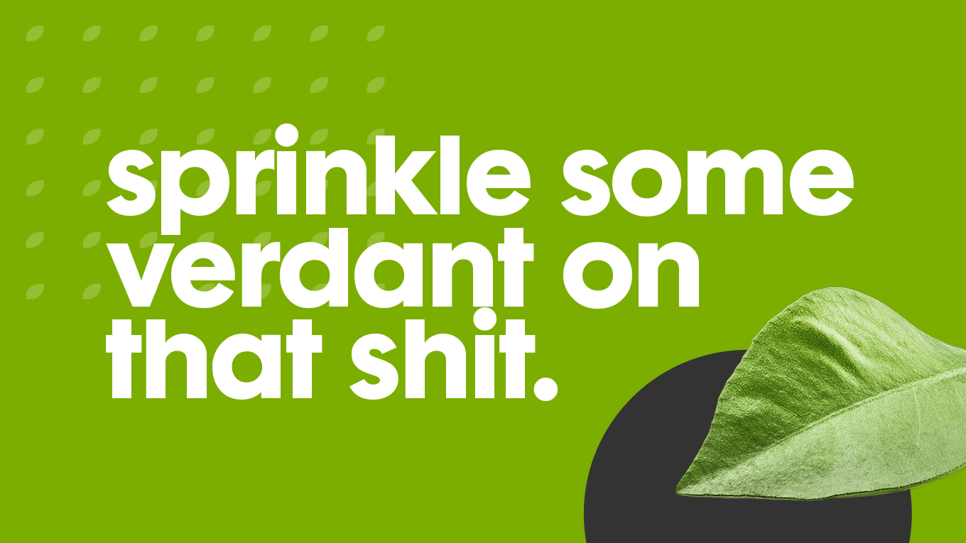
Every new brand needs great social posts — I designed and helped write almost all content for Verdant. Staying on-brand and on-tone was crucial to forming a cohesive style and gaining brand recognition. We reviewed our engagement metrics each week to home in on the right content and to ultimately improve our organic growth.

A revealing ad
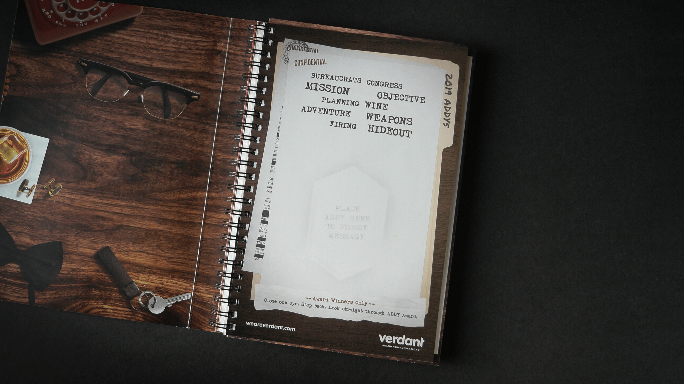
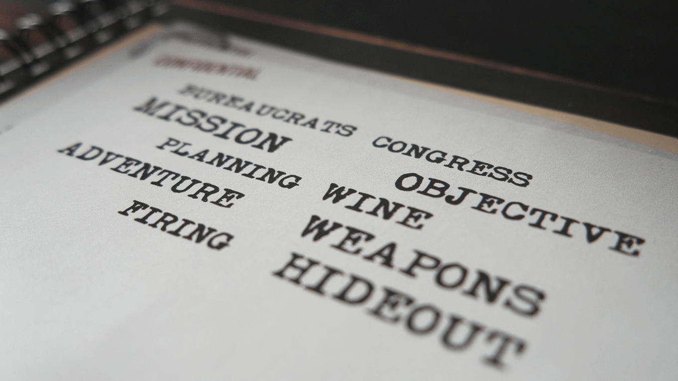
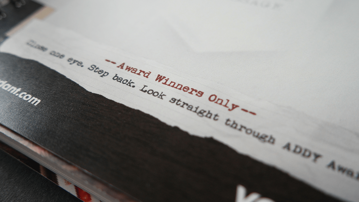
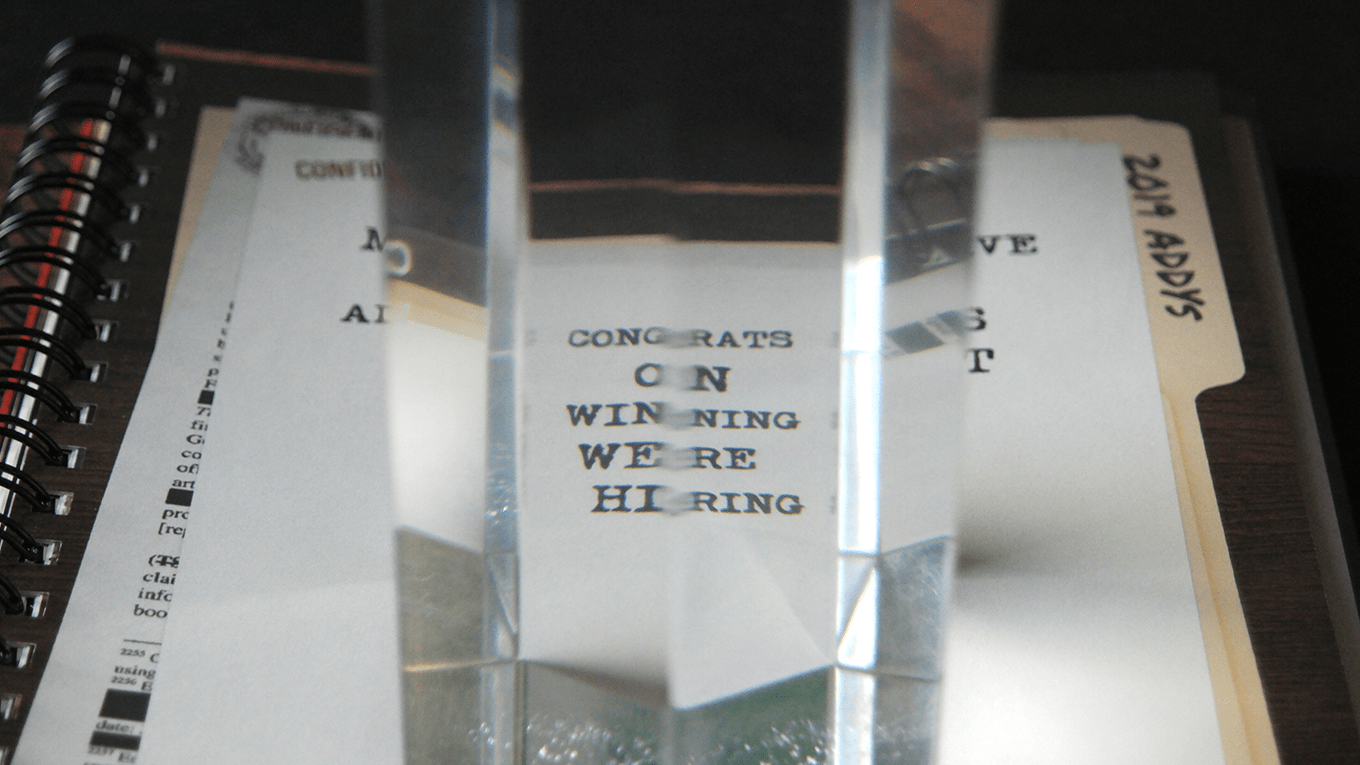
To help announce the new agency brand, we bought an ad in the yearly local advertising awards showbook. These books are given out to all attendees and feature the winning work of that year’s show. Each show has a theme and that year was “espionage” — we played off that and created an ad fit for James Bond himself.
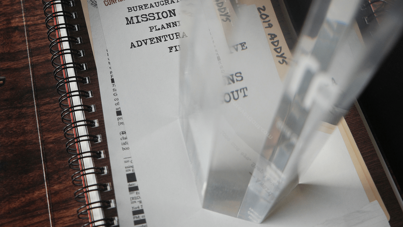
Spies are nothing without their secret messages, so we wanted to relay a covert message of our own to the winners of the night. We found a way to make the award itself part of the experience. Only when the clear lucite trophy is placed just right, can you decode the message, which reads “CONGRATS ON WINNING WERE HIRING”.

Award-Winning WorkThe showbook ad won Silver at the local Rochester American Advertising Awards.
